Dan
Grunebaum
About
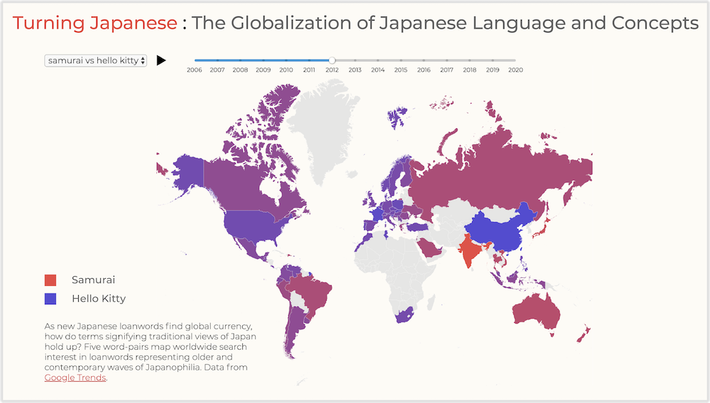
"Turning Japanese" visualizes Japan's transformation into a culture colossus. Designed as a Master's of Science thesis project for the Parsons Data Visualization program.
(JavaScript, D3, Vue)
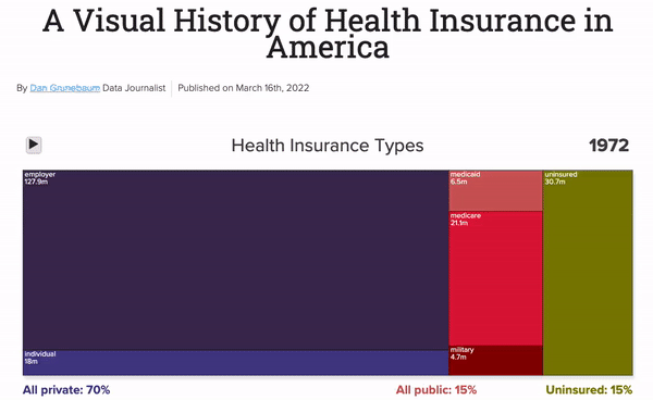
A scrollytelling history of health insurance in America designed for HealthCare.com.
(JavaScript, Scrollama, D3)
Population growth and distribution of America's fastest-growing minority.
(JavaScript, D3)
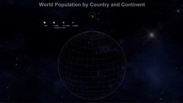
An animated world population counter globe designed to facilitate understanding of the populace's distribution by country and continent.
(JavaScript, D3, GEOJSON)
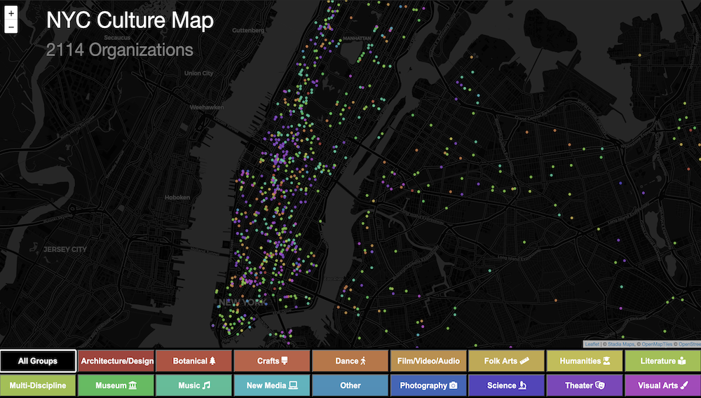
2,000 culture organizations paint a picture of the city's arts landscape.
(JavaScript, jQuery, Leaflet, p5)
Why Cape Cod’s beaches are in trouble
(After Effects, Premiere, Illustrator, Google Sheets)
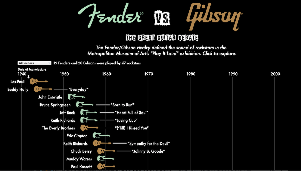
An interactive data visualization that explores the epic Fender-Gibson guitar brand rivalry.
(JavaScript, p5, jQuery)
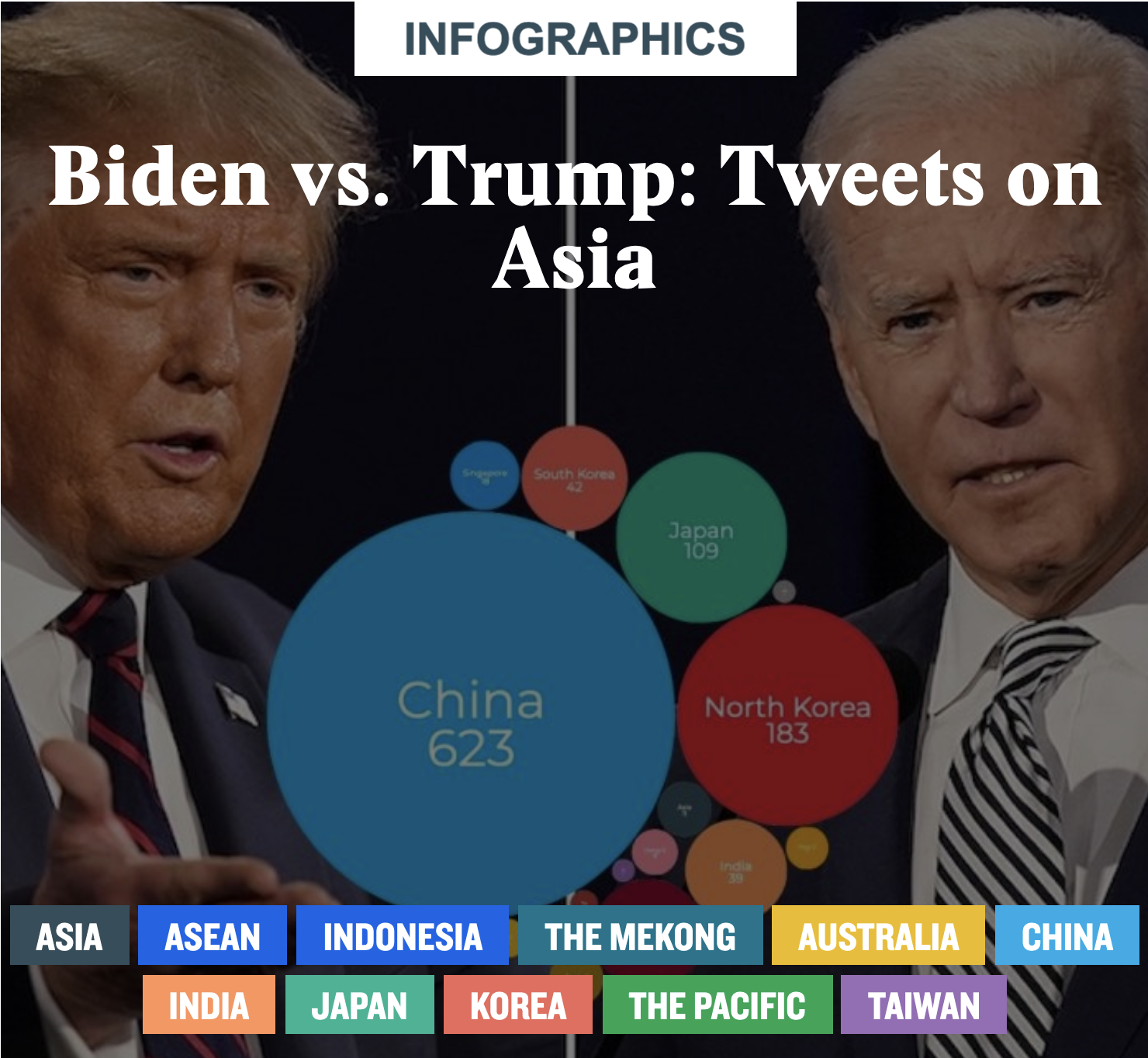
Created for the East-West Center during the 2020 U.S. Presidential Election.
(JavaScript, D3)
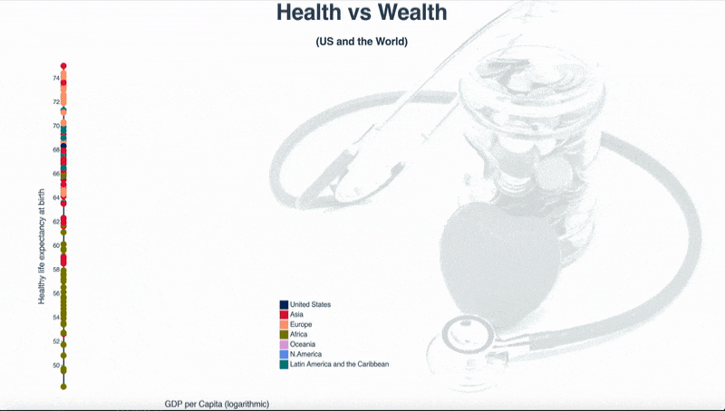
Are health and wealth correlated? This visualization examines the relationship between life expectancy and GDP.
(JavaScript, D3)
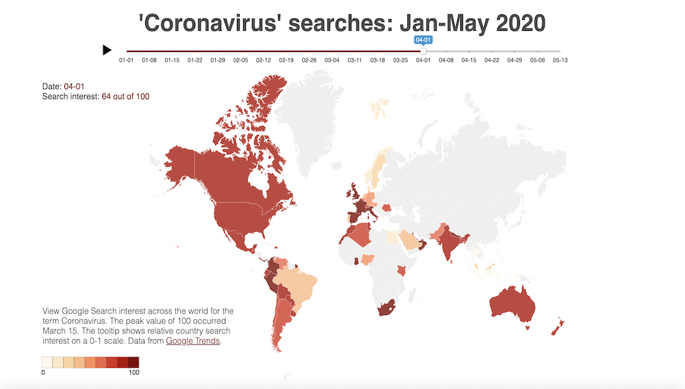
Google Search interest across the world for the term Coronavirus, Jan-May 2020.
(JavaScript, D3, Vue)
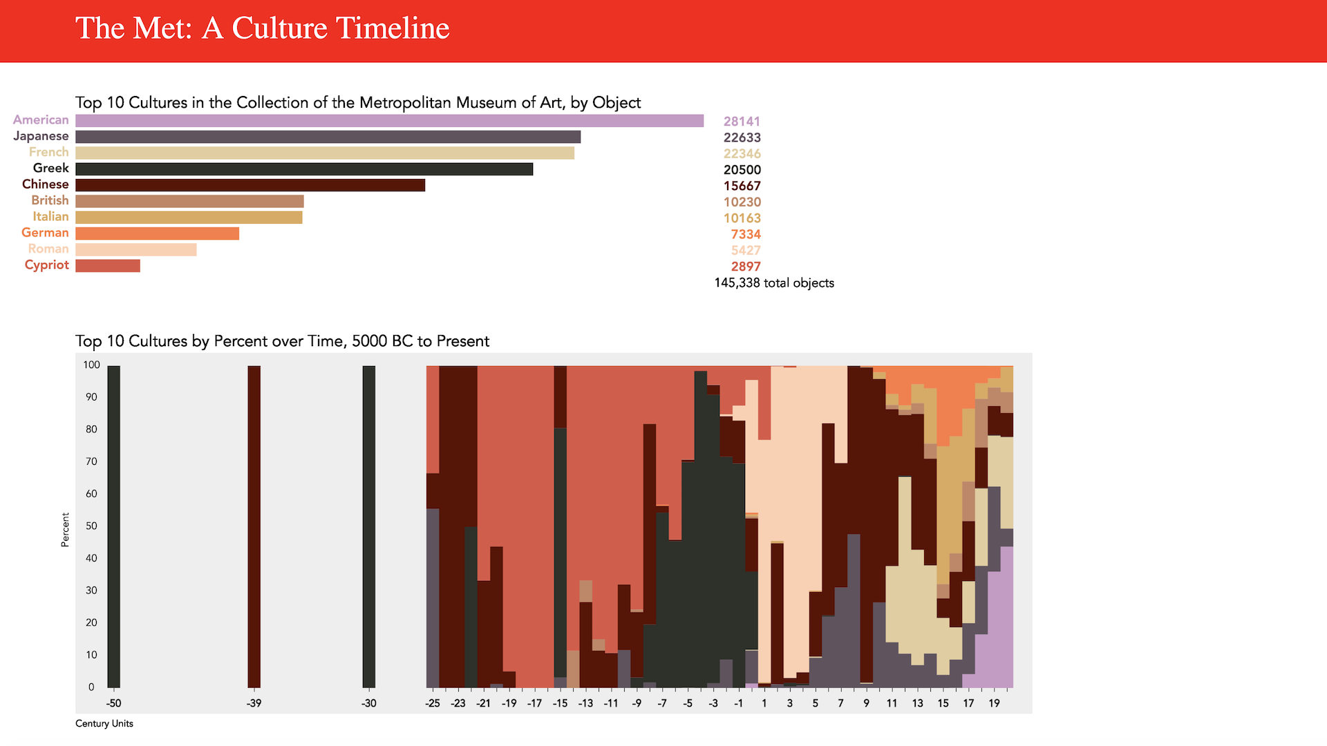
The Met: A Culture Timeline.
(JavaScript, p5)